Creating the Toasts with Bootstrap
The toast component is newly introduced in Bootstrap 4. They are lightweight notifications similar to push notifications that are shown by web browsers on computer screens. They’re built with flexbox, so you can easily align and position them on a web page.
Additionally, toasts are opt-in for performance reasons, so you must initialize them yourself with toast() method. Also, toasts will automatically hide after 5000 milliseconds (5 seconds), if you do not specify autohide: false option. Now let’s see how to create a toast.
Step 1: Adding the Toast Markup
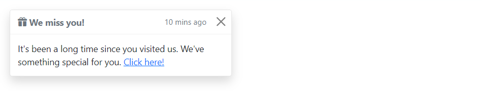
Toasts markups are pretty straightforward. The following example will show you how to create a toast component with a header, body, and a close button.
Example
<div class="toast" id="myToast">
    <div class="toast-header">
        <strong class="me-auto"><i class="bi-gift-fill"></i> We miss you!</strong>
        <small>10 mins ago</small>
        <button type="button" class="btn-close" data-bs-dismiss="toast"></button>
    </div>
    <div class="toast-body">
        It's been a long time since you visited us. We've something special for you. <a href="#">Click here!</a>
    </div>
</div>
Step 2: Triggering the Toasts
Toasts can be triggered via JavaScript — just call the toast() Bootstrap method with the id, class or any CSS selector of the target element in your JavaScript code.
Example
jQuery JavaScript
<script>
$(document).ready(function(){
    $("#myBtn").click(function(){
        $("#myToast").toast("show");
    });
});
</script>
— The output of the above example will look something like this:
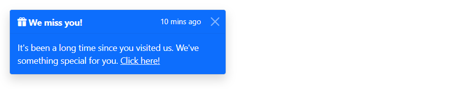
Changing the Toast’s Color Schemes
You can use the color and background utility classes to create toasts with different color schemes.
The following example will create a toast with blue background and white text.
Example
<div class="toast bg-primary text-white fade show">
    <div class="toast-header bg-primary text-white">
        <strong class="me-auto"><i class="bi-gift-fill"></i> We miss you!</strong>
        <small>10 mins ago</small>
        <button type="button" class="btn-close btn-close-white" data-bs-dismiss="toast"></button>
    </div>
    <div class="toast-body">
        It's been a long time since you visited us. We've something special for you. <a href="#" class="text-white">Click here!</a>
    </div>
</div>
— The output of the above example will look something like this:
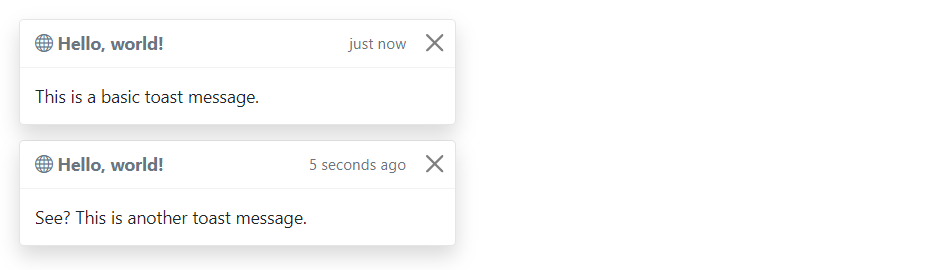
Stacking Toasts Vertically
You can stack multiple toasts vertically by simply wrapping them in a toast container, which will vertically add some spacing. Let’s take a look at the following example:
Example
<div class="toast-container">
    <div class="toast fade show">
        <div class="toast-header">
            <strong class="me-auto"><i class="bi-globe"></i> Hello, world!</strong>
            <small>just now</small>
            <button type="button" class="btn-close" data-bs-dismiss="toast"></button>
        </div>
        <div class="toast-body">
            This is a basic toast message.
        </div>
    </div>

    <div class="toast fade show">
        <div class="toast-header">
            <strong class="me-auto"><i class="bi-globe"></i> Hello, world!</strong>
            <small>5 seconds ago</small>
            <button type="button" class="btn-close" data-bs-dismiss="toast"></button>
        </div>
        <div class="toast-body">
            See? This is another toast message.
        </div>
    </div>
</div>
— The output of the above example will look something like this:
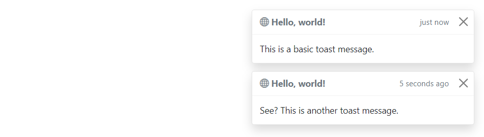
Placement of Toasts
You can place toasts anywhere on your web page using custom CSS positioning. However, the top right, bottom right, or top middle side is recommended for notifications.
Also, if you only want to show one toast at a time, put the positioning styles inline (i.e. directly on the .toast element). Let’s try out an example and see how it works:
Example
<div class="toast-container" style="position: absolute; top: 10px; right: 10px;">
    <div class="toast fade show">
        <div class="toast-header">
            <strong class="me-auto"><i class="bi-globe"></i> Hello, world!</strong>
            <small>just now</small>
            <button type="button" class="btn-close" data-bs-dismiss="toast"></button>
        </div>
        <div class="toast-body">
            This is a basic toast message.
        </div>
    </div>

    <div class="toast fade show">
        <div class="toast-header">
            <strong class="me-auto"><i class="bi-globe"></i> Hello, world!</strong>
            <small>5 seconds ago</small>
            <button type="button" class="btn-close" data-bs-dismiss="toast"></button>
        </div>
        <div class="toast-body">
            See? This is another toast message.
        </div>
    </div>
</div>
— The output of the above example will look something like this:
Options
There are certain options which can be passed to toast() Bootstrap method to customize the functionality of a toast. Options can be passed via data attributes or JavaScript.
For setting the toast options via data attributes, just append the option name to data-bs-, such as data-bs-autohide="false", data-bs-delay="3000", etc.
| Name | Type | Default Value | Description |
|---|---|---|---|
| animation | boolean | true | Apply a CSS fade transition to the toast. |
| autohide | boolean | true | Auto hide the toast. |
| delay | number | 5000 | Delay hiding the toast (ms). |
Data attributes provides an easy way for setting the toast options, however JavaScript is the more preferable way as it prevents you from repetitive work. See the passing options examples in the methods section below to know how to set the options for toasts using JavaScript.
In the following example we’ve set the autohide option to false using the data attribute (line no-1) which prevents the toast from closing automatically.
Example
<div class="toast" id="myToast" data-bs-autohide="false">
    <div class="toast-header">
        <strong class="me-auto"><i class="bi-gift-fill"></i> We miss you!</strong>
        <small>10 mins ago</small>
        <button type="button" class="btn-close" data-bs-dismiss="toast"></button>
    </div>
    <div class="toast-body">
        It's been a long time since you visited us. We've something special for you. <a href="#">Click here!</a>
    </div>
</div>
Methods
These are the standard bootstrap’s toast methods:
Passing options
You can additionally pass options to the toast using options object.
The following example code will prevent the toast from closing automatically.
Example
jQuery JavaScript
<script>
$(document).ready(function(){
    $("#myToast").toast({
        autohide: false
    });
});
</script>
The following example code will increase the autohide time of toast to 10 seconds.
Example
jQuery JavaScript
<script>
$(document).ready(function(){
    $("#myToast").toast({
        delay: 10000
    });
});
</script>
show
This method is used to display the toast.
Example
jQuery JavaScript
<script>
$(document).ready(function(){
    $(#myBtn").click(function(){
        $("#myToast").toast("show");
    });
});
</script>
hide
This method is used to hide toast. You’ve to manually call this method if you set autohide to false.
Example
jQuery JavaScript
<script>
$(document).ready(function(){
    $(#myBtn").click(function(){
        $("#myToast").toast("hide");
    });
});
</script>
dispose
This method hides an element’s toast. The toast will remain on the DOM but won’t show anymore.
Example
jQuery JavaScript
<script>
$(document).ready(function(){
    $(#myBtn").click(function(){
        $("#myToast").toast("dispose");
    });
});
</script>
getInstance
This is a static method which allows you to get the toast instance associated with a DOM element.
Example
jQuery JavaScript
<script>
$(document).ready(function(){
    $("#myBtn").click(function(){
        var myToast = bootstrap.Toast.getInstance($("#myToast")[0]);
        console.log(myToast);
        // {_element: div#myToast.toast.fade.show, _config: {…}, _timeout: null, _hasMouseInteraction: false, _hasKeyboardInteraction: false}
    });
});
</script>
getOrCreateInstance
This is a static method which allows you to get the toast instance associated with a DOM element, or create a new one in case if the toast wasn’t initialized.
Example
jQuery JavaScript
<script>
$(document).ready(function(){
    $("#myBtn").click(function(){
        var myToast = bootstrap.Toast.getOrCreateInstance($("#myToast")[0]);
        console.log(myToast);
        // {_element: div#myToast.toast.fade.show, _config: {…}, _timeout: null, _hasMouseInteraction: false, _hasKeyboardInteraction: false}
    });
});
</script>
Tip: Static methods cannot be called on instances of the class (i.e. objects). They’re called on the class itself. The keyword static is used to define a static method for a class.
Events
Bootstrap’s modal class includes few events for hooking into modal functionality.
| Event | Description |
|---|---|
| show.bs.toast | This event fires immediately when the show instance method is called. |
| shown.bs.toast | This event is fired when the toast has been made visible to the user. It will wait until the CSS transition process has been fully completed before getting fired. |
| hide.bs.toast | This event is fired immediately when the hide instance method has been called. |
| hidden.bs.toast | This event is fired when the toast has finished being hidden from the user. It will wait until the CSS transition process has been fully completed before getting fired. |
The following example will display an alert message to the user when the fade out transition of the toast has been fully completed. Let’s try it out and see how it works:
Example
jQuery JavaScript
<script>
$(document).ready(function(){
    $("#myToast").on("hidden.bs.toast", function(){
        alert("Toast component has been completely closed.");
    });
});
</script>
Leave a Reply