Creating Modals with Bootstrap
Modal is basically a dialog box or popup window that is used to provide important information to the user or prompt user to take necessary actions before moving on. Modals are widely used to warn users for situations like session time out or to receive their final confirmation before going to perform any critical actions such as saving or deleting important data.
You can easily create very smart and flexible dialog boxes with the Bootstrap modal plugin. The following example oulines the basic structure to create a simple modal with a header, message body and the footer containing action buttons for the user.
Example
jQuery JavaScript
<!-- jQuery Code (to Show Modal on Page Load) -->
<script>
$(document).ready(function() {
$("#myModal").modal("show");
});
</script>
<!-- Modal HTML -->
<div id="myModal" class="modal fade" tabindex="-1">
<div class="modal-dialog">
<div class="modal-content">
<div class="modal-header">
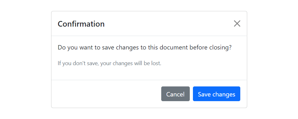
<h5 class="modal-title">Confirmation</h5>
<button type="button" class="btn-close" data-bs-dismiss="modal"></button>
</div>
<div class="modal-body">
<p>Do you want to save changes to this document before closing?</p>
<p class="text-secondary"><small>If you don't save, your changes will be lost.</small></p>
</div>
<div class="modal-footer">
<button type="button" class="btn btn-secondary" data-bs-dismiss="modal">Cancel</button>
<button type="button" class="btn btn-primary">Save changes</button>
</div>
</div>
</div>
</div>— If you try out the above example, it will launches the modal window automatically when the DOM is fully loaded via JavaScript. The output will look something like this:
Leave a Reply